Over the last 12 months, the training course I have delivered most often has been our Dynamic Sales Presentations workshop. This has been incredibly gratifying for me personally, as I have long been an advocate of the importance of presentation skills for Channel Account Managers, particularly when dealing with partners/MSPs, where the challenge is not just differentiating your product, but also gaining mindshare and being remembered in a very crowded space.
Interestingly, every time I have run this course, someone has invariably said “I didn’t realise you could do that” after I utilised one of PowerPoint’s lesser known features. So after several requests from people over the last few months, I have put together my Top 10 Tips for capturing and maintaining your audience’s attention.
Tips for Breaking up the Monotony
1. The B Key
Improve your engagement by turning off PowerPoint momentarily and get the audience to focus on you. If you press the letter “B” during the presentation, it will black out the screen and give you the opportunity to shift from being presenter to facilitator/collaborator. Completely changes the feel in the room, and heightens audience engagement.
2. Navigation
During your presentation, you can jump to a slide by typing in the slide number then hitting enter. Perfect if you want to skip a section without clicking through every slide. Which means you can now include all the slides you think you might need, but then skip over them if you decide not to use them on the day.
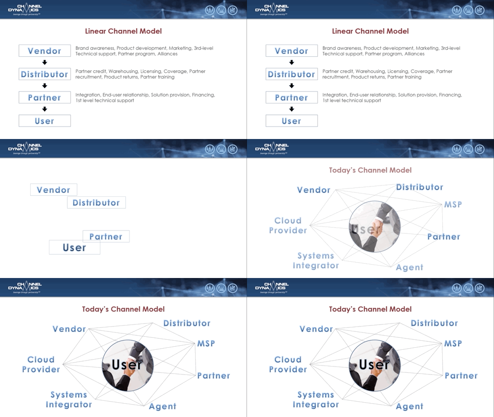
3. Morph Transition
Use this transition to move from one slide to the next, and have an image move with you to create continuity between ideas. Just copy the image to the following slide, position/size it, and PowerPoint will create a seamless transition.

4. F5/Shift-F5 Keys
Jump into presentation mode quickly, rather than having to click on that tiny slide show icon. It just makes the beginning of a presentation less fiddly. F5 starts from the beginning, where as Shift-F5 starts from the slide you are on.
Tips for Simplifying Complex Slides
5. Less text
If you hate looking at slides with too much text, then it’s a safe bet your audience does also. Remove the bulk of the text, and increase the font size (typically you need a minimum of 24pt). Handy Hint: keep the original slide in the deck, but hide it – it makes for a good reference for you, and you can use it to send to audience members who ask for a copy of your deck (which happens a lot more often when you don’t bore them)

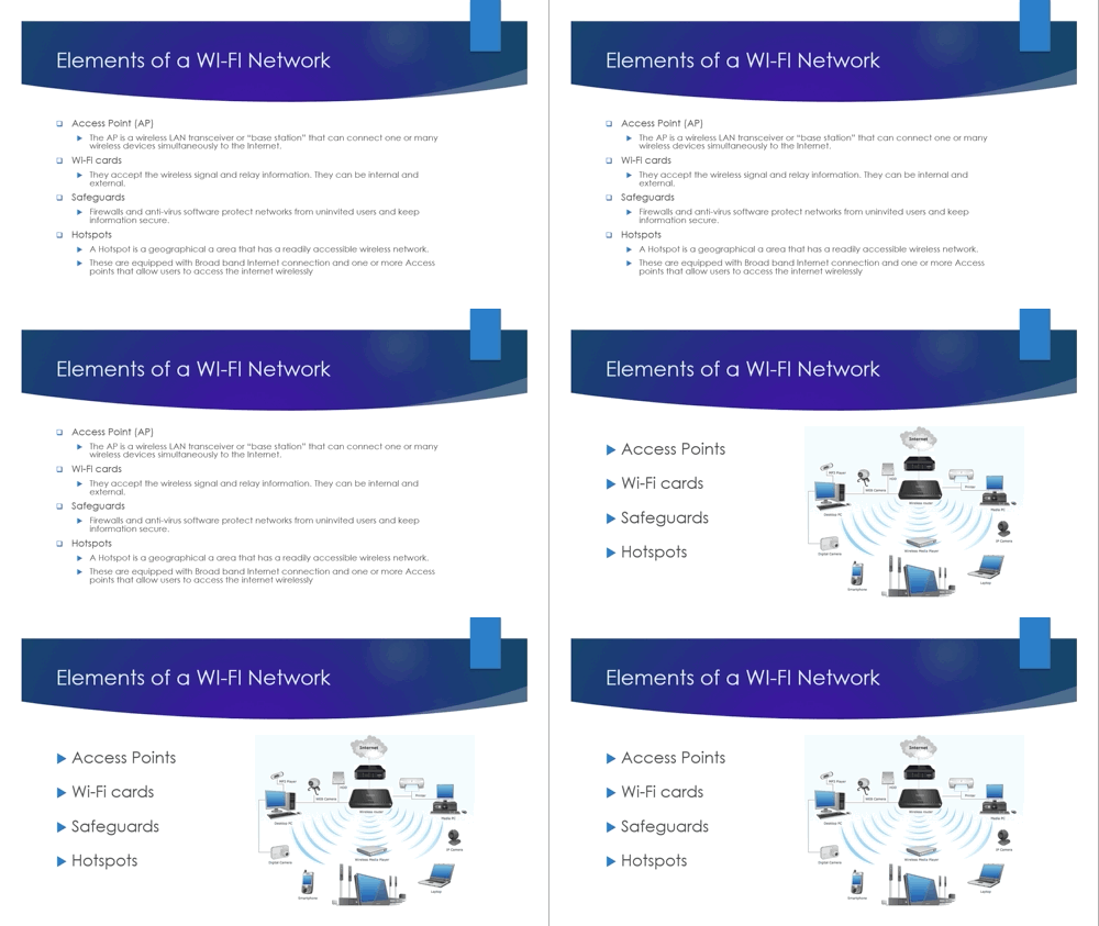
6. Animate Complex Images
If your image is made up of multiple components, then introduce them one after the other to make it easier for your audience to follow your message. Handy Hint: if you have a single image, and when you right click on it, the word “Group” is not greyed out, you can probably Ungroup it into its various components.

7. Reveal Complex Pictures
What if your picture can’t be broken into components? Instead, cover sections of it with white boxes, then slowly have them disappear – using the “Fade” animation – to reveal the image (a bit like teachers used to do with sheets of paper and overhead projectors). But make sure the slide animations are aligned with your style and timing, not you trying to fit in with theirs.

Tips for Presenting Numerical Data
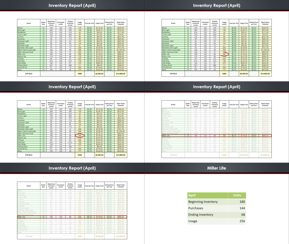
8. Highlight the Important Bits
Use circles or boxes to highlight the section you want your audience to focus on. And as I said earlier, make it big enough to read. Pet Peeve: I’m not a big fan of the laser pointer – most presenters wave it about wildly, and it’s often hard to see the red dot. I prefer to go up to the screen and point to it.
9. Summarise the Key Info
Any slide that begins with you saying “You probably can’t read this, but…” doesn’t belong in your deck. If you have critical information you need to present, then select it, and put it on a slide of its own. Yes, it takes more time, but what would you rather – an easy slide that no-one pays attention to, or one that gets your message across?

10. Create Meaningful Charts
Use charts to present numbers in a graphic form. Personally, I think the default font sizes in PowerPoint are too small. So remember to increase them, and make sure you use a consistent colour scheme. If you use charts often, save your preferred format as a Style that you can re-use.
If you have your own tips, I’d be keen to hear from you. Drop me a note at mmoses@channeldynamics.com.au. And if you’re interested in sharpening your own presentation skills, be sure to check out our Dynamic Sales Presentations workshop.


